See the product before you sign up.
Every image below is a capture of the running application, taken by the same automated run that checks the app still works. Nothing here is drawn, staged, or retouched. The product tour explains how the workflow fits together; this page shows the screens you would spend the day in.
You open it to a list of what to do, not a dashboard.
Today is derived from the pipeline rather than configured: a buyer who came in through a for-sale page and is waiting on an answer, a lead whose first email is due, a follow-up that has come round. Each row carries its own next action, and a row that cannot be actioned yet says why instead of failing when you click it.
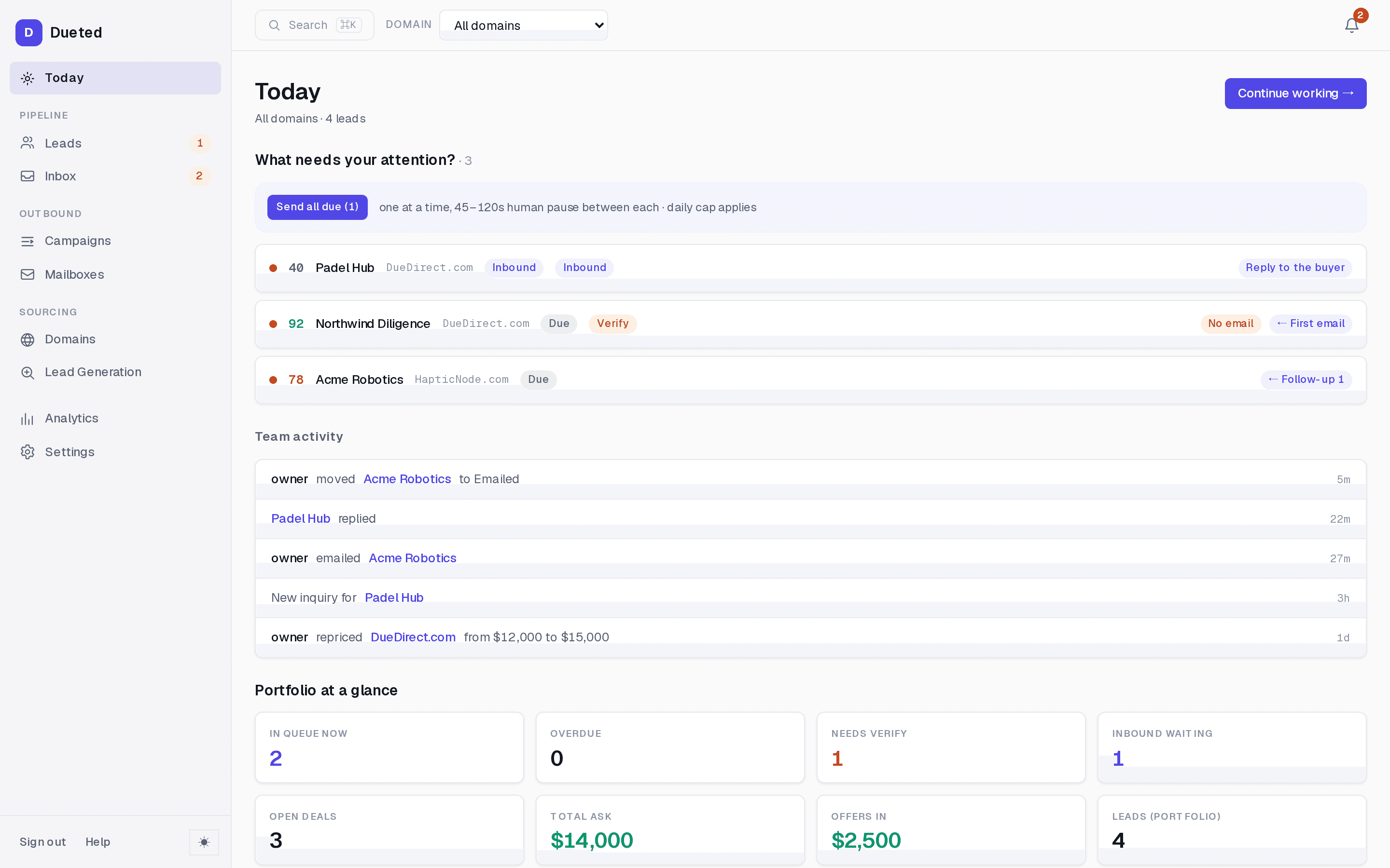
The domain selector at the top rescopes the whole app. A broker running six names needs one screen for all of them and the same screen for one of them, so every count, list and total on every page follows that selector.
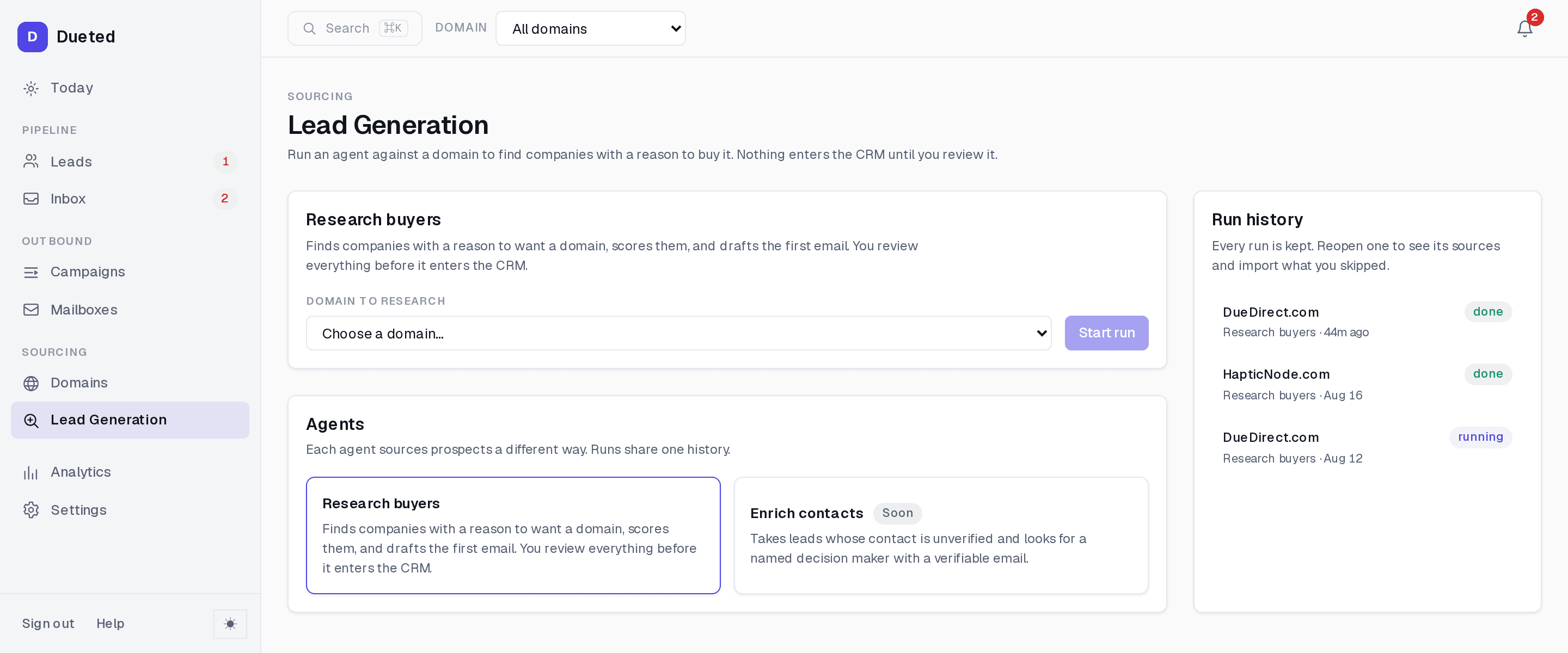
Finding the buyers is a screen too, and every run is kept.
Point the research agent at one of your domains and it comes back with companies that have a reason to want it, scored, with the sources it read. Nothing enters the CRM until you review it. Runs are stored, so closing the tab does not lose the results, and reopening a run shows every source behind a score rather than the first few.
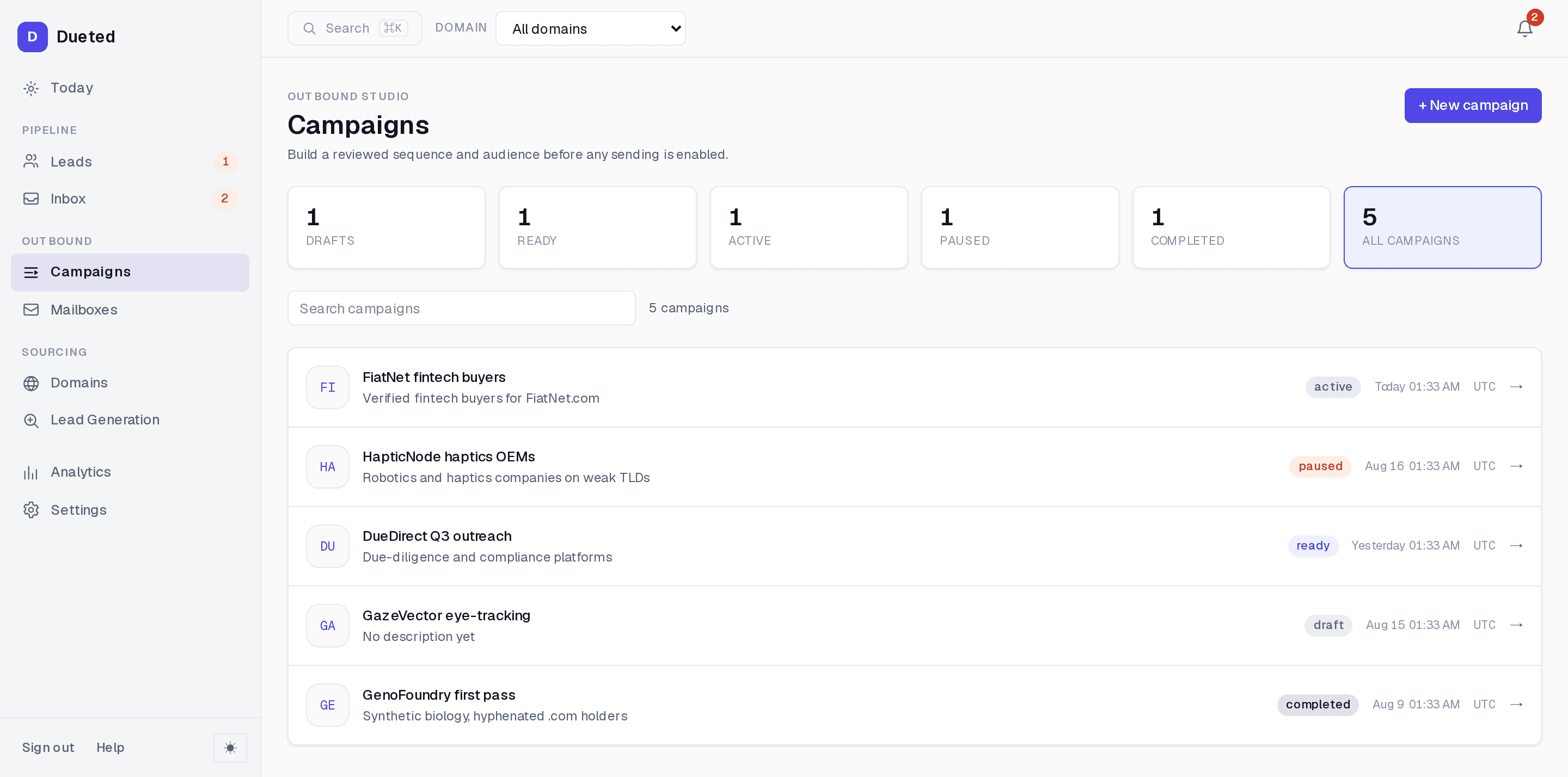
A campaign has a lifecycle, and the counts are the filters.
Draft, ready, active, paused, completed. The state is on the row and the tile above it is the filter for that state, so narrowing to what is live is one click. Nothing sends from a draft: a campaign has to have a reviewed sequence and audience before sending can be enabled at all.
Before it can send, a campaign has to prove it is ready.
The overview lists every gate and its current state: an approval recorded against a person and a date, an audience rule that has been reviewed, recipients loaded, suppression checked, variables resolved, the plan complete. Underneath, in plain sentences, exactly what that approval covers: how many emails, how far apart, which contacts the rule includes, and what happens if someone replies.
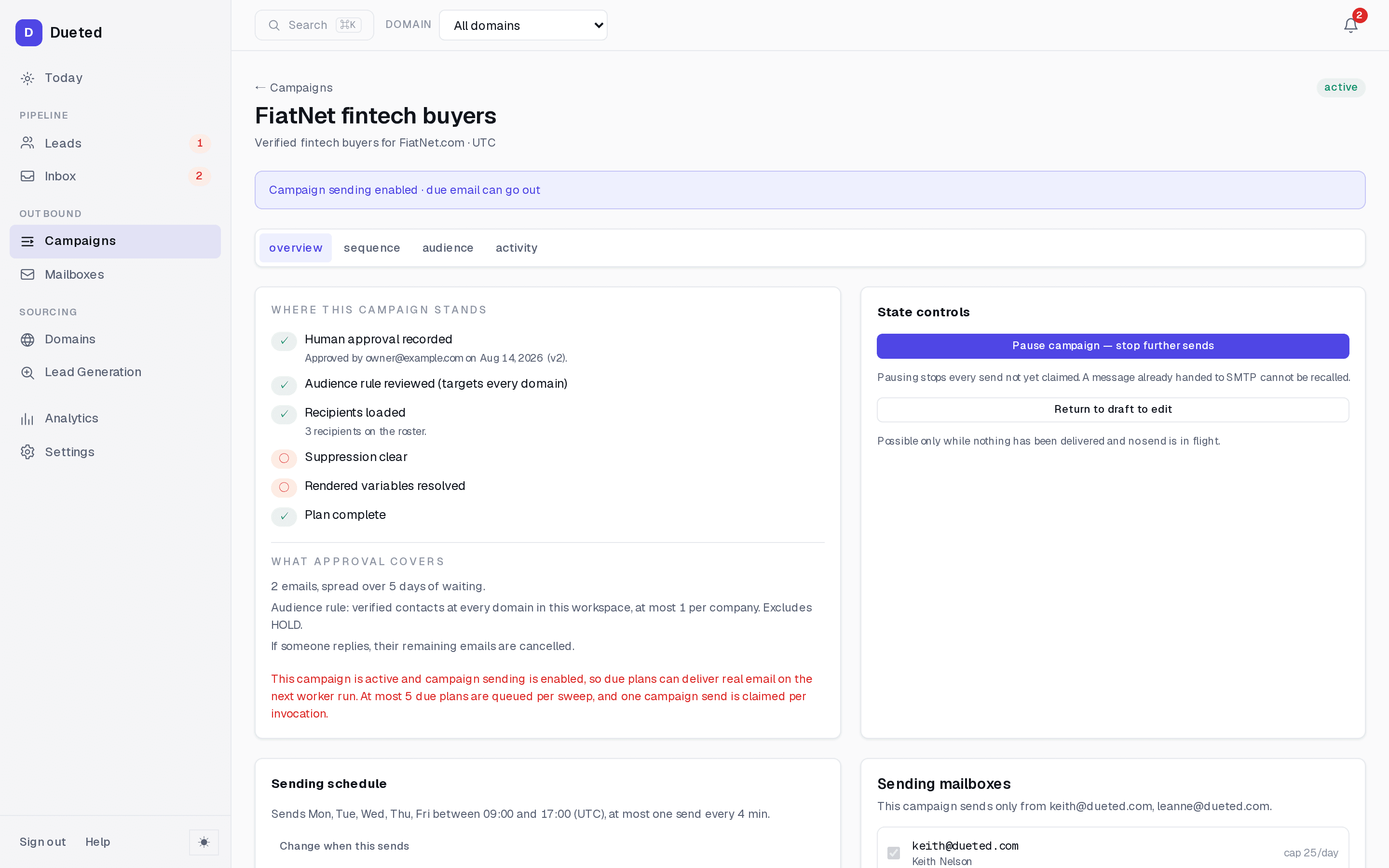
When a campaign is active and sending is enabled, the page says so in red. Real email leaving on the next worker run is the one fact a sending tool should never make you infer.
On a phone it is the same product, reflowed.
The navigation collapses and lists become cards, so a row is readable without scrolling sideways. Same data, same actions, same wording. Both captures below are the full length of the screen at 390 pixels wide, not a crop.
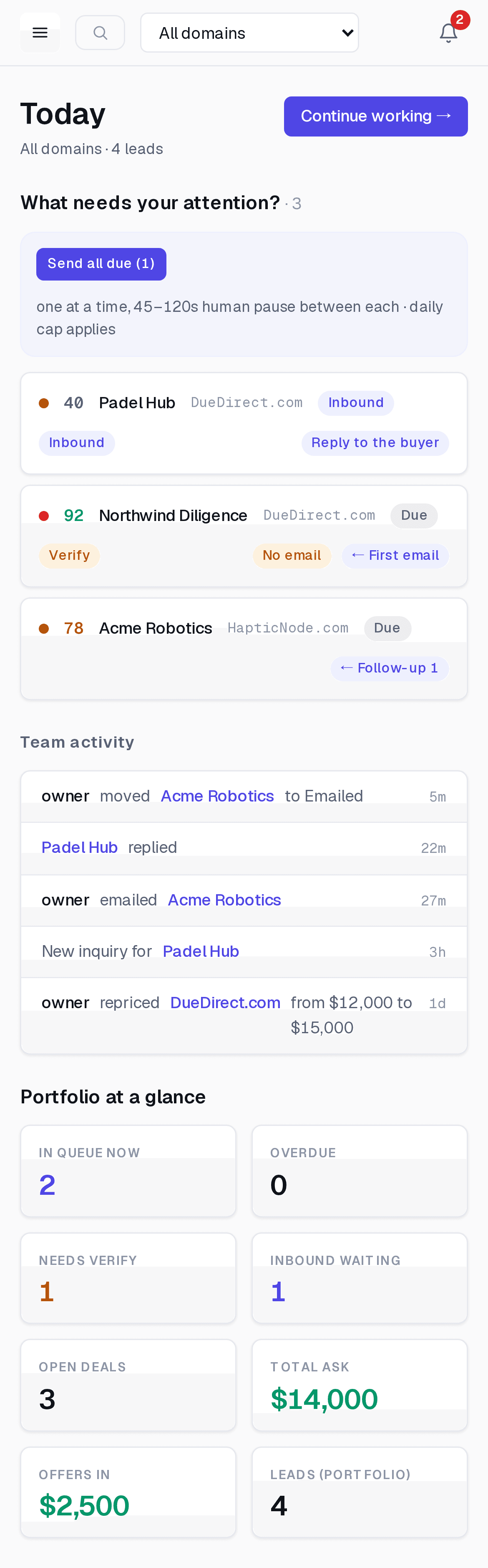
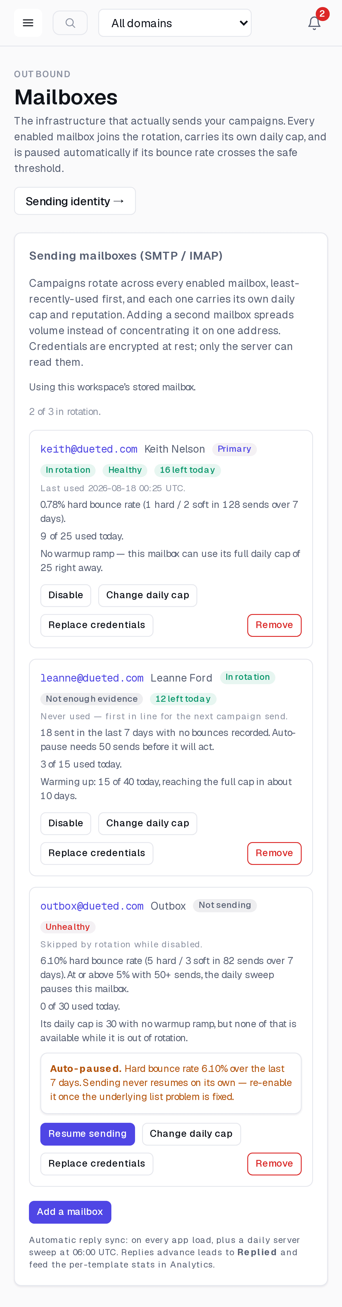
Today and Mailboxes on a phone. The attention rows keep their next-action buttons and the portfolio totals go two across.
The top bar survives the narrow viewport intact. The hamburger opens the same navigation, and search, the domain selector and the notification count stay where they are, so rescoping the app to a single name works on a phone exactly as it does at a desk.
Each mailbox keeps its rotation state, its bounce rate and its daily cap. The third one is auto-paused, and the reason and the fix are on the card rather than behind it, which is the whole point of a card list over a cropped table: nothing important moves off-screen.
To click around it, load the example portfolio.
A new workspace starts empty, and Today offers to fill it. One button loads two example domains and five leads spread across the pipeline: one not contacted, one emailed, one on its first follow-up, one that replied with an offer on the table, and one inbound inquiry that arrived through a for-sale page.
Every one of those rows is marked as sample data, a banner says so while it is loaded, and it is only visible to you. Clearing it deletes exactly those rows and nothing you have added yourself. Then import your own domains and the screens above are yours.
The example covers the pipeline, not sending. A campaign sends from a mailbox you own and have connected, so no sample can stand in for that part, and none pretends to.
Open the real one.
A workspace takes about a minute, and the example portfolio is one button away once you are in. Dueted is free while in beta.